Product Design
Onboarding, simplified
Reducing a complex healthcare onboarding flow from 12 screens to 4
Role
Staff Product Designer
Scope
UX Strategy · UI · Design Systems · AI Prototyping
Timeline
2 weeks
Impact
12 to 4 screens

Overview
TandemStride helps people navigate care and resources after a traumatic, life-altering injury. But before users could get any of that value, they had to get through 12 daunting onboarding screens.
I inherited the flow and reduced it from 12 screens to 4, cutting the number of exit points while establishing reusable patterns and components that became part of our design system.
Challenge: Current Onboarding Flow
I inherited this onboarding experience that reflected TandemStride’s complexity - not users' needs. My challenge was aligning the team around what we needed upfront, what could wait, and what could disappear.
12 screens = 12 opportunities to leave
Everything was treated as equally urgent
“Skip” helped completion, but hurt data quality
Users were asked for sensitive information before seeing any value or trust was established
How might we ask less upfront without losing the critical data we need?

How I approached it
Audited the flow and questioned the purpose of every step
Worked with PM + engineering to separate need now from we could ask later
Consolidated related inputs and moved nonessential questions downstream
Prototyped, tested, cut, refined, and shipped
The rule: If we didn't need it to get someone started, it didn't belong in onboarding
Clickable Prototype
The thinking behind it

Open with immediate social proof
Before asking for anything, I wanted users to feel like they were joining something bigger, not filling out another health form. I replaced a generic “you’re not alone” message with tangible proof that others are already here.
Key decisions
Opened with a count of people in the community
Animated the number on entry to give the moment energy
Set expectations with a 2-minute commitment upfront
Tradeoff
A live count required more engineering, so my PM and I scoped V1 to a manually updated number.
Collapse 14 screens into 4
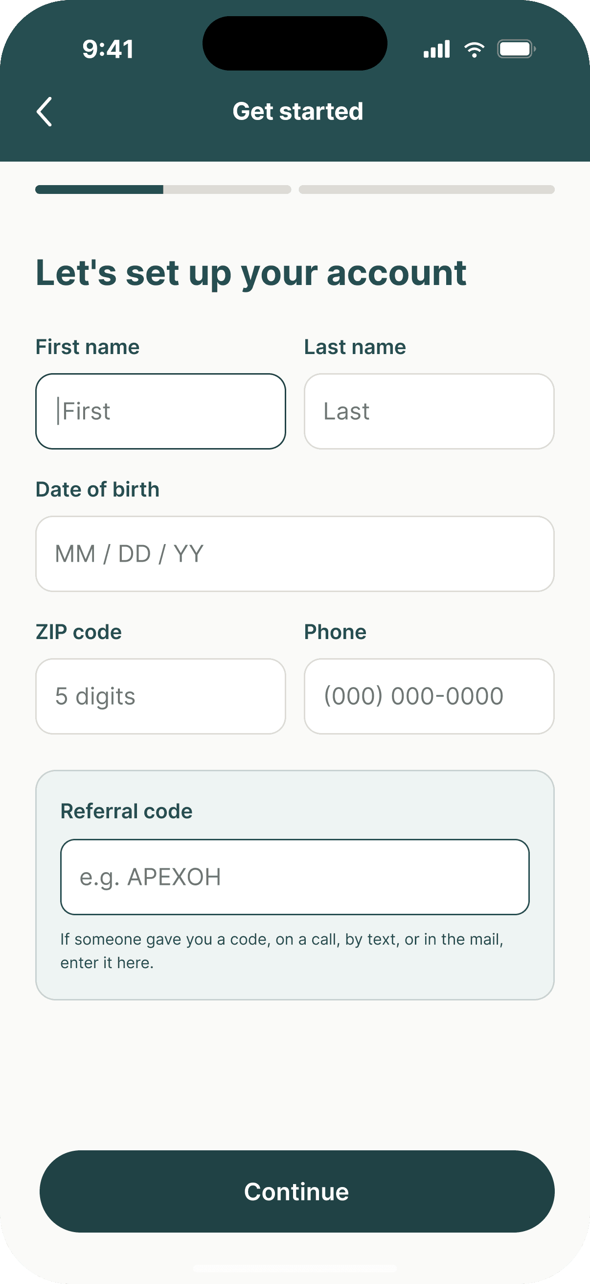
One-question-per-screen works for branching decisions, but name, DOB, ZIP, and phone are one mental task. I grouped related inputs onto a single screen, establishing a pattern for the rest of onboarding: group by task, not database field.
Key decisions
Reduced 12 exit points to 4
Grouped related fields into one validated form
Used 52px inputs for easier one-handed entry
Disabled Continue until required fields were valid
Tradeoff
The screen became denser, so I used paired fields, generous spacing, and progressive validation to keep it manageable.

Ask like a human, not a clinical robot
The old flow asked users to classify themselves as Survivor, Loved One, Mentor, or Support, then separately asked what they needed. I replaced both with one question that matched how people actually think: “What brings you here?”
Key decisions
Combined two classification steps into one question
Replaced internal labels with plain language
Wrote responses in first person: “I was injured”
Reduced the decision to three clear paths
Tradeoff
Three broader paths meant less specificity upfront, but gave us enough information to route users without making them decode our taxonomy.
Make completion feel like a beginning
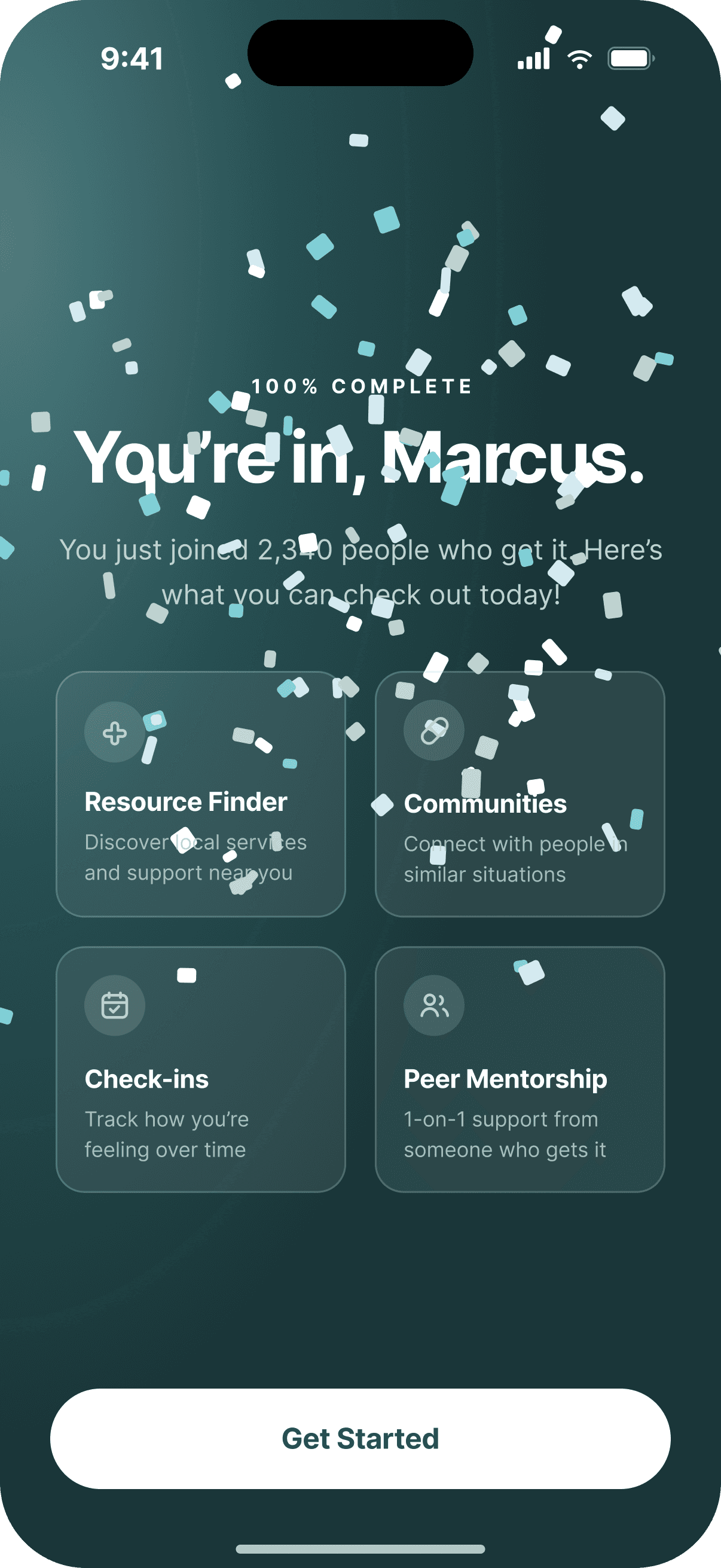
The old flow ended with a generic “we’ll be in touch.” I turned completion into a launchpad into the product, celebrating the user while showing them what was waiting on the other side.
Key decisions
Used progress + confetti to create a clear completion moment
Previewed four features available inside the app
Kept one obvious primary action: Get Started
Avoided auto-advancing so users controlled when they moved on
Tradeoff
Showing four features introduced more choice, so I treated them as previews rather than actions and kept Get Started as the clear next step.

Trauma-informed mostly meant not asking
The old onboarding asked people to share sensitive details before they had experienced any value. I introduced a simple rule: collect in context. Sensitive information moved to the moment users could understand why we needed it.
Key decisions
Moved injury details from onboarding into relevant features
Kept genuinely required business data upfront
Removed “Skip” from fields we actually needed
Let users experience the product before asking for more
Tradeoff
We now ask for injury data later, adding a step to features like Peer Matching, so users can clearly see why we're asking it and how it will be used.
What I designed… then cut
The first solution wasn't 4 screens - getting to 4 screens required me to keep designing, questioning and cutting. If a screen didn't earn a place in “Now,” it moved or disappeared.

What are you looking for?
Was intended to inform and create hype, but it sat nex tot the priorities screen, it was the same question in different words

What we offer
A mid-flow product pitch sounded helpful but interrupted momentum. We moved it to the last frame as a jumping off point instead.

How can we reach you?
Two fields didn't need their own screen - works better in the personal info section/mental model
Three quick ones
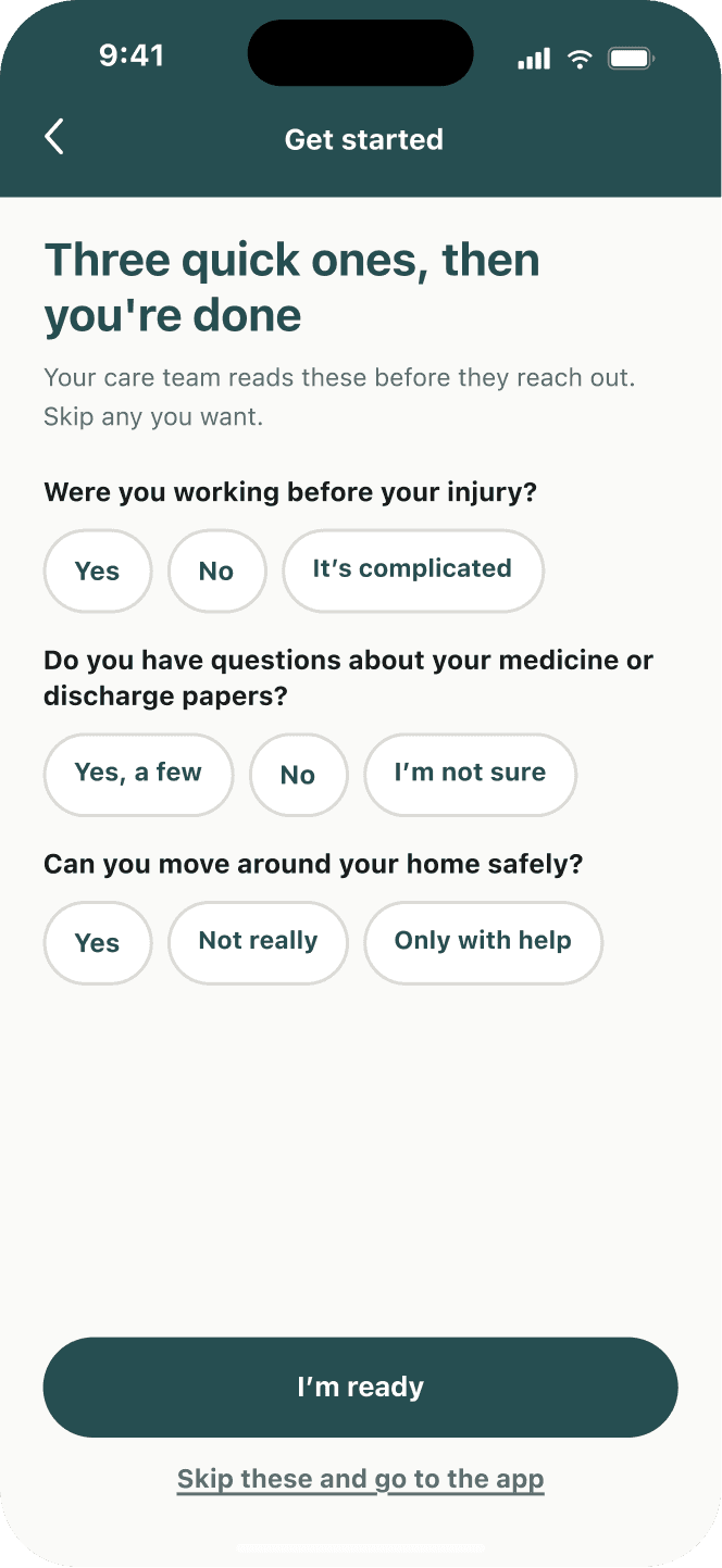
We want to squeeze out extra insights while we had their attention - but it was asking too much before delievering value

What would help most?
It overlapped with the help-topics screen and it’s another decision fatigue moment (when in reality, they probably want help with all 4)

Confirm your details
Right idea for accuracy, but impractical from a user pov, nobody needs to confirm 4 fields they just typed (they can also edit within the “Account Settings” section)
Designing the system, not just screens
FigmaMCP x ClaudeCode
I structured our components and design tokens so Claude Code could understand and build from the same system I was using in Figma.
Key decisions
Standardized color, type, spacing, radius, and other values as design tokens
Built onboarding with reusable components and consistent variants
Used Figma MCP to give Claude structured access to the design
Connected design tokens to coded prototypes instead of recreating styles by hand
Used Claude Code to rapidly test designs as working interfaces
So, did it work?
12 to 4 screens
68% onboarding completion (+28%)
130s faster completion
25% lower drop-off
X% activation increase
Product Design
Onboarding, simplified
Reducing a complex healthcare onboarding flow from 12 screens to 4
Role
Staff Product Designer
Scope
UX Strategy · UI · Design Systems · AI Prototyping
Timeline
2 weeks
Impact
12 to 4 screens
Overview
TandemStride helps people navigate care and resources after a traumatic, life-altering injury. But before users could get any of that value, they had to get through 12 daunting onboarding screens.
I inherited the flow and reduced it from 12 screens to 4, cutting the number of exit points while establishing reusable patterns and components that became part of our design system.
Challenge: Current Onboarding Flow
I inherited this onboarding experience that reflected TandemStride’s complexity - not users' needs. My challenge was aligning the team around what we needed upfront, what could wait, and what could disappear.
12 screens = 12 opportunities to leave
Everything was treated as equally urgent
“Skip” helped completion, but hurt data quality
Users were asked for sensitive information before seeing any value or trust was established
How might we ask less upfront without losing the critical data we need?
How I approached it
Audited the flow and questioned the purpose of every step
Worked with PM + engineering to separate need now from we could ask later
Consolidated related inputs and moved nonessential questions downstream
Prototyped, tested, cut, refined, and shipped
The rule: If we didn't need it to get someone started, it didn't belong in onboarding
Clickable Prototype
The thinking behind it
Open with immediate social proof
Before asking for anything, I wanted users to feel like they were joining something bigger, not filling out another health form. I replaced a generic “you’re not alone” message with tangible proof that others are already here.
Key decisions
Opened with a count of people in the community
Animated the number on entry to give the moment energy
Set expectations with a 2-minute commitment upfront
Tradeoff
A live count required more engineering, so my PM and I scoped V1 to a manually updated number.
Collapse 14 screens into 4
One-question-per-screen works for branching decisions, but name, DOB, ZIP, and phone are one mental task. I grouped related inputs onto a single screen, establishing a pattern for the rest of onboarding: group by task, not database field.
Key decisions
Reduced 12 exit points to 4
Grouped related fields into one validated form
Used 52px inputs for easier one-handed entry
Disabled Continue until required fields were valid
Tradeoff
The screen became denser, so I used paired fields, generous spacing, and progressive validation to keep it manageable.
Ask like a human, not a clinical robot
The old flow asked users to classify themselves as Survivor, Loved One, Mentor, or Support, then separately asked what they needed. I replaced both with one question that matched how people actually think: “What brings you here?”
Key decisions
Combined two classification steps into one question
Replaced internal labels with plain language
Wrote responses in first person: “I was injured”
Reduced the decision to three clear paths
Tradeoff
Three broader paths meant less specificity upfront, but gave us enough information to route users without making them decode our taxonomy.
Make completion feel like a beginning
The old flow ended with a generic “we’ll be in touch.” I turned completion into a launchpad into the product, celebrating the user while showing them what was waiting on the other side.
Key decisions
Used progress + confetti to create a clear completion moment
Previewed four features available inside the app
Kept one obvious primary action: Get Started
Avoided auto-advancing so users controlled when they moved on
Tradeoff
Showing four features introduced more choice, so I treated them as previews rather than actions and kept Get Started as the clear next step.
Trauma-informed mostly meant not asking
The old onboarding asked people to share sensitive details before they had experienced any value. I introduced a simple rule: collect in context. Sensitive information moved to the moment users could understand why we needed it.
Key decisions
Moved injury details from onboarding into relevant features
Kept genuinely required business data upfront
Removed “Skip” from fields we actually needed
Let users experience the product before asking for more
Tradeoff
We now ask for injury data later, adding a step to features like Peer Matching, so users can clearly see why we're asking it and how it will be used.
What I designed… then cut
The first solution wasn't 4 screens - getting to 4 screens required me to keep designing, questioning and cutting. If a screen didn't earn a place in “Now,” it moved or disappeared.
What are you looking for?
Was intended to inform and create hype, but it sat nex tot the priorities screen, it was the same question in different words
What we offer
A mid-flow product pitch sounded helpful but interrupted momentum. We moved it to the last frame as a jumping off point instead.
How can we reach you?
Two fields didn't need their own screen - works better in the personal info section/mental model
Three quick ones
We want to squeeze out extra insights while we had their attention - but it was asking too much before delievering value
What would help most?
It overlapped with the help-topics screen and it’s another decision fatigue moment (when in reality, they probably want help with all 4)
Confirm your details
Right idea for accuracy, but impractical from a user pov, nobody needs to confirm 4 fields they just typed (they can also edit within the “Account Settings” section)
Designing the system, not just screens
FigmaMCP x ClaudeCode
I structured our components and design tokens so Claude Code could understand and build from the same system I was using in Figma.
Key decisions
Standardized color, type, spacing, radius, and other values as design tokens
Built onboarding with reusable components and consistent variants
Used Figma MCP to give Claude structured access to the design
Connected design tokens to coded prototypes instead of recreating styles by hand
Used Claude Code to rapidly test designs as working interfaces
So, did it work?
12 to 4 screens
68% onboarding completion (+28%)
130s faster completion
25% lower drop-off
X% activation increase
Product Design
Onboarding, simplified
Reducing a complex healthcare onboarding flow from 12 screens to 4
Role
Staff Product Designer
Scope
UX Strategy · UI · Design Systems · AI Prototyping
Timeline
2 weeks
Impact
12 to 4 screens
Overview
TandemStride helps people navigate care and resources after a traumatic, life-altering injury. But before users could get any of that value, they had to get through 12 daunting onboarding screens.
I inherited the flow and reduced it from 12 screens to 4, cutting the number of exit points while establishing reusable patterns and components that became part of our design system.
Challenge: Current Onboarding Flow
I inherited this onboarding experience that reflected TandemStride’s complexity - not users' needs. My challenge was aligning the team around what we needed upfront, what could wait, and what could disappear.
12 screens = 12 opportunities to leave
Everything was treated as equally urgent
“Skip” helped completion, but hurt data quality
Users were asked for sensitive information before seeing any value or trust was established
How might we ask less upfront without losing the critical data we need?
How I approached it
Audited the flow and questioned the purpose of every step
Worked with PM + engineering to separate need now from we could ask later
Consolidated related inputs and moved nonessential questions downstream
Prototyped, tested, cut, refined, and shipped
The rule: If we didn't need it to get someone started, it didn't belong in onboarding
Clickable Prototype
The thinking behind it
Open with immediate social proof
Before asking for anything, I wanted users to feel like they were joining something bigger, not filling out another health form. I replaced a generic “you’re not alone” message with tangible proof that others are already here.
Key decisions
Opened with a count of people in the community
Animated the number on entry to give the moment energy
Set expectations with a 2-minute commitment upfront
Tradeoff
A live count required more engineering, so my PM and I scoped V1 to a manually updated number.
Collapse 14 screens into 4
One-question-per-screen works for branching decisions, but name, DOB, ZIP, and phone are one mental task. I grouped related inputs onto a single screen, establishing a pattern for the rest of onboarding: group by task, not database field.
Key decisions
Reduced 12 exit points to 4
Grouped related fields into one validated form
Used 52px inputs for easier one-handed entry
Disabled Continue until required fields were valid
Tradeoff
The screen became denser, so I used paired fields, generous spacing, and progressive validation to keep it manageable.
Ask like a human, not a clinical robot
The old flow asked users to classify themselves as Survivor, Loved One, Mentor, or Support, then separately asked what they needed. I replaced both with one question that matched how people actually think: “What brings you here?”
Key decisions
Combined two classification steps into one question
Replaced internal labels with plain language
Wrote responses in first person: “I was injured”
Reduced the decision to three clear paths
Tradeoff
Three broader paths meant less specificity upfront, but gave us enough information to route users without making them decode our taxonomy.
Make completion feel like a beginning
The old flow ended with a generic “we’ll be in touch.” I turned completion into a launchpad into the product, celebrating the user while showing them what was waiting on the other side.
Key decisions
Used progress + confetti to create a clear completion moment
Previewed four features available inside the app
Kept one obvious primary action: Get Started
Avoided auto-advancing so users controlled when they moved on
Tradeoff
Showing four features introduced more choice, so I treated them as previews rather than actions and kept Get Started as the clear next step.
Trauma-informed mostly meant not asking
The old onboarding asked people to share sensitive details before they had experienced any value. I introduced a simple rule: collect in context. Sensitive information moved to the moment users could understand why we needed it.
Key decisions
Moved injury details from onboarding into relevant features
Kept genuinely required business data upfront
Removed “Skip” from fields we actually needed
Let users experience the product before asking for more
Tradeoff
We now ask for injury data later, adding a step to features like Peer Matching, so users can clearly see why we're asking it and how it will be used.
What I designed… then cut
The first solution wasn't 4 screens - getting to 4 screens required me to keep designing, questioning and cutting. If a screen didn't earn a place in “Now,” it moved or disappeared.
What are you looking for?
Was intended to inform and create hype, but it sat nex tot the priorities screen, it was the same question in different words
What we offer
A mid-flow product pitch sounded helpful but interrupted momentum. We moved it to the last frame as a jumping off point instead.
How can we reach you?
Two fields didn't need their own screen - works better in the personal info section/mental model
Three quick ones
We want to squeeze out extra insights while we had their attention - but it was asking too much before delievering value
What would help most?
It overlapped with the help-topics screen and it’s another decision fatigue moment (when in reality, they probably want help with all 4)
Confirm your details
Right idea for accuracy, but impractical from a user pov, nobody needs to confirm 4 fields they just typed (they can also edit within the “Account Settings” section)
Designing the system, not just screens
FigmaMCP x ClaudeCode
I structured our components and design tokens so Claude Code could understand and build from the same system I was using in Figma.
Key decisions
Standardized color, type, spacing, radius, and other values as design tokens
Built onboarding with reusable components and consistent variants
Used Figma MCP to give Claude structured access to the design
Connected design tokens to coded prototypes instead of recreating styles by hand
Used Claude Code to rapidly test designs as working interfaces
So, did it work?
12 to 4 screens
68% onboarding completion (+28%)
130s faster completion
25% lower drop-off
X% activation increase